
| 일 | 월 | 화 | 수 | 목 | 금 | 토 |
|---|---|---|---|---|---|---|
| 1 | 2 | 3 | 4 | 5 | 6 | 7 |
| 8 | 9 | 10 | 11 | 12 | 13 | 14 |
| 15 | 16 | 17 | 18 | 19 | 20 | 21 |
| 22 | 23 | 24 | 25 | 26 | 27 | 28 |
| 29 | 30 |
- 호키스
- 스위프트
- 힛잇
- 자료구조
- hokeys
- 개발
- data structure
- react
- 리액트
- IOS
- 스벨트
- Hitit
- SWIFT
- queue
- hokidoki
- 호키도키
- 자스민
- 개발자
- 자바스크립트
- HTML
- 이종호
- TDD
- Svelte
- 자바스크립트 자료구조
- 계명대
- 비동기
- 리액트 예제
- javascript
- jest
- 계명대 이종호
- Today
- Total
Dog foot print
[css] flex-box 본문
css를 만지면서 가장 힘들다고 느끼는 점은 한 div안에 고정적인 공간이 한개 혹은 두개 있는 경우 가변적인 공간의 크기를 할당하는 일이다.
100% - 250px-300px 이게 된다면 얼마나 좋을까 그런데 안된다. // sass는 된다고 알고있다.
여튼 이런 불편함을 제거 해주고자 css3는 다양하고 사용하기 쉬운 flex-box를 제공한다.
FLEX-BOX
flex-box는 item을 담고 있는 containner와 containner내부에 있는 item으로 구분 한다.
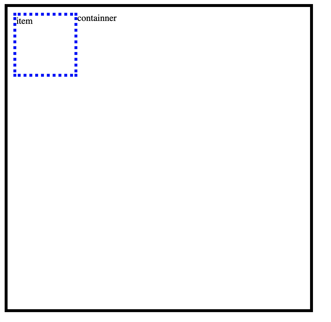
사용은 굉장히 쉽다. containner가 되는 div에 display : flex 를 선언한걸로 시작한다.
 .containner{
     		display: flex;
            width: 500px;
            height: 500px;
            border : 5px solid black;
            padding: 10px;

        }
        .item{
            width: 100px;
            height: 100px;
            border: 5px dotted blue;
        }
Flex-box 속성들
containner의 속성 : flext direction , flex-wrap, justify-content, align-items, align=content
item 의 속성 : flex, flex-grow, flex-shirink, flex-basis, order
[네이버 d2참조]
flex-direction
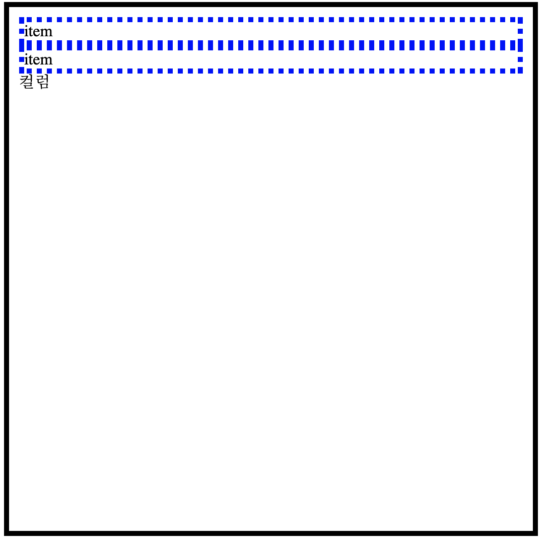
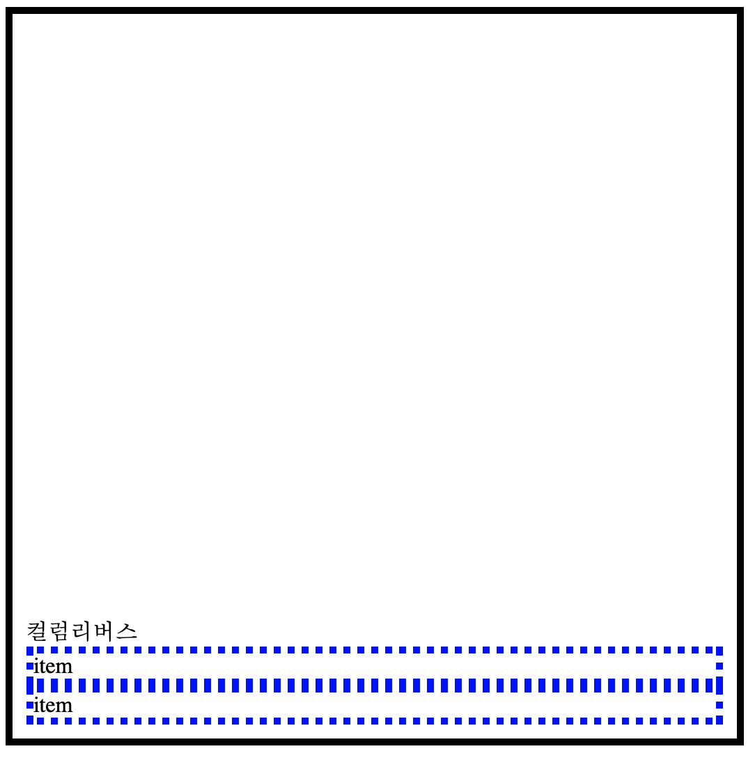
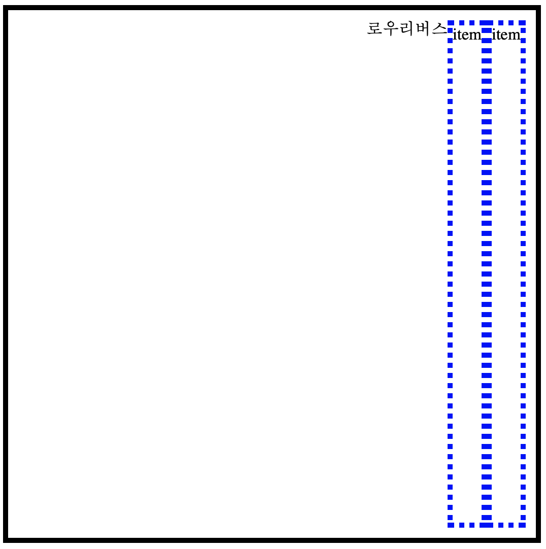
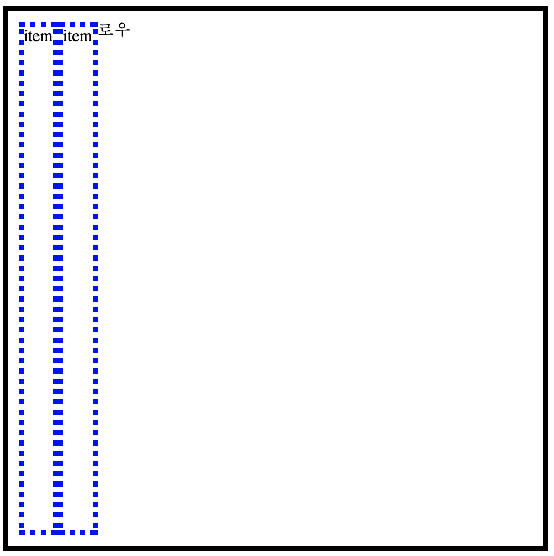
flex-direction 은 4가지의 value를 갖는다. // "column", "row", "column-reverse", "row-reverse"
flex-direction은 containner가 아이템을 정렬하는 축의방향을 결정한다.
flex-wrap
item들이 강제로 한줄에 배치될 건지 containner안에 일정하게 배치될건지를 결정한다. 밸류는 "no-wrap", "wrap" 이 있다.
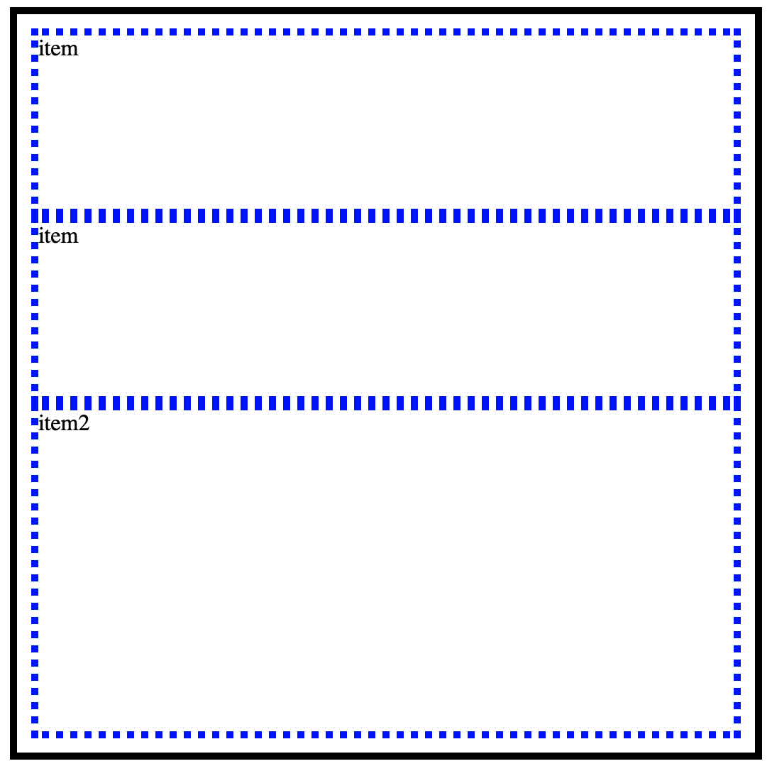
flex-grow
item들이 containner의 여백을 가지게 되는 비율이다.
 .item{
            border: 5px dotted blue;
            flex-grow: 1;
        }
item이 두 개 있고 grow로 1을 줬으니 여백을 가져가는 비율은 1/2 이다.
     .item{
            border: 5px dotted blue;
            flex-grow: 1;
        }
        .item_2{
            border: 5px dotted blue;
            flex-grow: 2;
        }
flex-basis
item의 기본 크기를 정하는 속성이다.
flex-shirink
item 의 크기가 containner의 크기보다 커질 경우 flex-shirink값을 보고 flex item의 요소가 작아진다.
참조
https://d2.naver.com/helloworld/8540176
'CSS' 카테고리의 다른 글
| [css]반응형 웹을 만들기 위한 media-query (0) | 2019.07.08 |
|---|---|
| [css] 세로 중앙에 아이템 배치하기 (0) | 2019.07.07 |
| [css] box의 구성 padding 과 margin . (0) | 2019.07.05 |
| [ css ] css를 적용 하는 방법 (0) | 2019.07.04 |
| [css] width 와 height 단위 (0) | 2019.07.03 |


